Last Wednesday, June 26, 2019, the R-Ladies Chicago got together for a Summer Social Meetup over wine and coding. It was a great opportunity to meet people, socialize and, of course, have some drinks!
We were supposed to taste some beverages (wine tasting was optional, there were non-alcoholic drinks too) and rate them for a collaborative activity afterwards. So, what are the R-Ladies wine preferences? In this post I’ll present the data we produced in a simple tutorial.
For this activity I just used tidyverse to do some data wrangling and visualization, RCurl to upload the csv from the R-Ladies Github repository and lubridate to play a little bit with the Timestamp variable.
Let’s see how the data set looks like:
#uploading packages
library(tidyverse)
library(lubridate)
library(RCurl)

#uploading data from the R-Ladies repository (Here I'm using RCurl)
wine<-read.csv(text=getURL("https://raw.githubusercontent.com/rladies-chicago/2019-06-26-sip-and-code-round2/master/sipncode2019.csv"))

#taking a look at the first lines
head(wine)
## Timestamp drink_category drink_name drink_rating
## 1 6/26/19 18:02 Non-Alcoholic Blood Orange Pellegrino's 84
## 2 6/26/19 18:03 Non-Alcoholic Blood Orange Pellegrino's 85
## 3 6/26/19 18:04 Non-Alcoholic Blood Orange Pellegrino's 88
## 4 6/26/19 18:10 Non-Alcoholic Grapefruit LaCroix 90
## 5 6/26/19 18:10 Non-Alcoholic Grapefruit LaCroix 80
## 6 6/26/19 18:11 Non-Alcoholic Blood Orange Pellegrino's 98We have four variables: 1) Timestamp, that is a factor with the time that the rate was entered in the data set; 2) drink_category categorizes the beverages as non-alcoholic or as Wine/Champagne; 3) drink_name, that is a factor; 4) drink_rating, an interger. Let’s see how many ratings each drink category received.
wine%>%
  count(drink_category)
## # A tibble: 2 x 2
## drink_category n
## <fct> <int>
## 1 Non-Alcoholic 19
## 2 Wine/Champagne 70The data set has 89 ratings, 19 for non-alcoholic and 70 for alcoholic beverages. I’ll focus this exploration on the alcoholic drinks. All the bottles were opened at the same time and we were free to choose whatever we wanted to try. It means that each participant had tried as many wines as they wanted, but rated each of them only once. Let’s take a look at the distribution of these ratings among our options.
#setting the ggplot theme
theme_set(theme_classic())

#plotting
wine%>%
  filter(drink_category=="Wine/Champagne")%>%
  ggplot(aes(drink_name,drink_rating))+
  geom_boxplot()+
  geom_dotplot(binaxis="y",
               stackdir="center",
               dotsize = .8,
               fill="red")+
  theme(axis.text.x = element_text(angle=70, vjust=0.6))+
  labs(title="Distribution of ratings per alcoholic beverages",
        caption="Source: R-Ladies Chicago",
        x="",
        y="Ratings")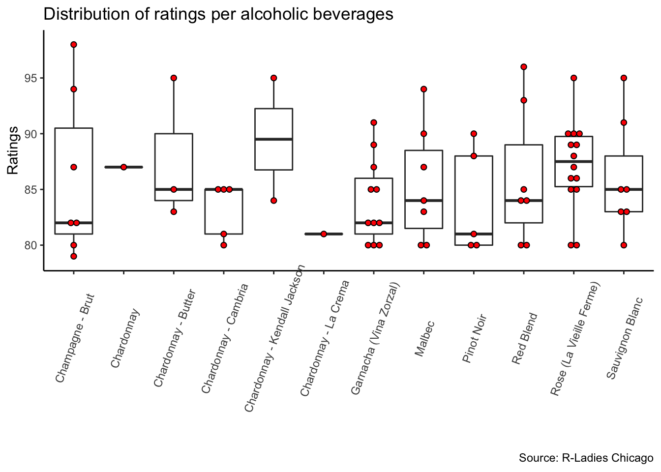
The red dots are each rating in the data set. The data is very unequally distributed and this can lead us to biased conclusions if we don’t analyze them carefully. For example, the Chardonnay - Kendall Jackson has the highest mean rate (89.5), but only two participants tasted it. In turn, Rose (La Vie Ferme) was tasted by 14 ladies and presented a lower mean rate (87).
So, I decided to reclassify the drinks in other three broader categories: 1) White Wine/Champagne, where I’ve put the Champagne - Brut, all the Chardonnays and the Sauvignon Blanc; 2) Light Red Wine, which are the Pinot Noir and Rose; 3) Red Wine, that are the Garnacha, Malbec and Red Blend. Then, I’ve plotted the distribution of the ratings in this new classification.
#reclassifying

wine_new<-wine%>%
  filter(drink_category=="Wine/Champagne")%>%
  mutate(new_category=as.factor(case_when(drink_name=="Chardonnay - La Crema" ~ "Champagne/White Wine",
                                          drink_name=="Chardonnay - Cambria" ~ "Champagne/White Wine",
                                          drink_name=="Pinot Noir" ~ "Light Red Wine",
                                          drink_name=="Garnacha (Vina Zorzal)" ~ "Red Wine",
                                          drink_name=="Malbec" ~ "Red Wine",
                                          drink_name=="Champagne - Brut" ~ "Champagne/White Wine",
                                          drink_name== "Red Blend" ~ "Red Wine",
                                          drink_name== "Sauvignon Blanc" ~ "Champagne/White Wine",
                                          drink_name=="Chardonnay" ~ "Champagne/White Wine",
                                          drink_name=="Rose (La Vieille Ferme)" ~ "Light Red Wine",
                                          drink_name=="Chardonnay - Butter" ~ "Champagne/White Wine",
                                          drink_name=="Chardonnay - Kendall Jackson" ~ "Champagne/White Wine")))

#plotting

wine_new%>%
  ggplot(aes(new_category,drink_rating))+
  geom_boxplot()+
  geom_dotplot(binaxis="y",
               stackdir="center",
               dotsize = .8,
               fill="red")+
  theme(axis.text.x = element_text(angle=45, vjust=0.6))+
  labs(title="Distribution of ratings per category",
       caption="Source: R-Ladies Chicago",
       x="",
       y="Ratings")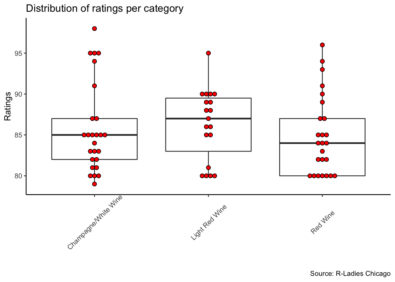
If we look only at the mean of the ratings (Light Red Wine= 86.3; Champagne/White Wine= 85.8; Red Wine= 84.9) it seems that R-Ladies slightly prefered the Light Red Wines. However, there are some many outliers in all three categories that is hard to say if there was any preferred type.
The data set comprises ratings along one hour of the meeting, from around 6 to 7 pm. The meeting started at 5:45 and finished around 8 or 8:30 pm. The next plot shows how the ratings were distributed in this time frame.
##transforming the time variable using lubridate
wine_new$Timestamp<-mdy_hm(wine_new$Timestamp)


#ploting the count of alcoholic beverages tasted every 3 minutes
wine_new%>%
  ggplot(aes(Timestamp))+
  geom_freqpoly(binwidth= 180)+
  labs(title="Count of alcoholic beverages tasted",
       subtitle="at every three minutes",
       caption="Source: R-Ladies Chicago",
       x= "")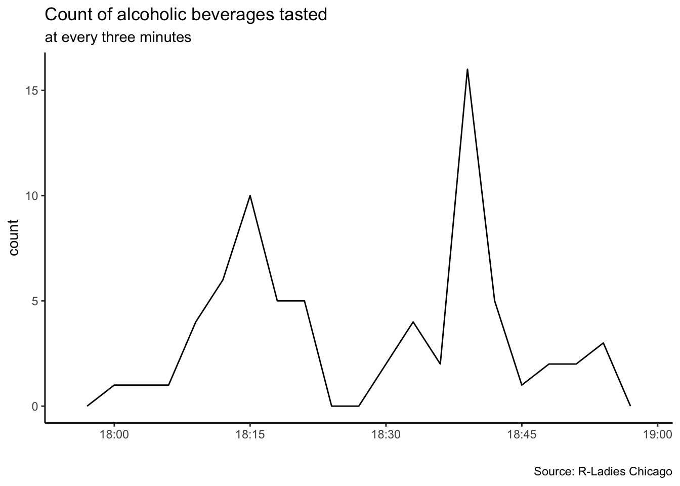
This plot makes sense to me. People started to arrive in bigger numbers around 6pm and we were encouraged to start tasting the wines by the R-Ladies board by 6:15. Around 6:30 there was a general announcement about how to scan the bar code in order to rate the beverages. These may explain the higher numbers of ratings around 6:15 and 6:40. By 6:45 we had annoucenments and intros, what explains the lower count of ratings around this time.
So, what can we say about the R-Ladies wine preferences? Probably that a good wine is the one you drink with inspiring women while playing a bit with ggplot.
If you are new to R and got a bit lost in this tutorial I highly recommend to take a look at the R-Ladies Chicago Beginners’ Repository on Github.